The project: Conduct a tree test and prepare a report proposing new information architecture for texas.gov as a project for a UX metrics course
Constraints: Free-tier tool with a two-task limit; recruited from classmates only
Tech: UXTweak, Microsoft Word, Snagit
I chose texas.gov for two reasons: it's a high-stakes public site that needs to work for a wide range of users, and I had just started in Web Services at TxDOT, which maintains a similarly high-stakes site. I ran an unmoderated tree test with two tasks (finding school district information, updating voter registration) across desktop and mobile, recruiting five participants from my class.
What I did
Set up the test tree using texas.gov's actual navigation, focusing on three top-level sections relevant to the two tasks
Analyzed success rate, directness, time on task, first-click data, and open-ended feedback — not just whether people succeeded, but how
Traced a directness problem (80% on Task 2, with one participant backtracking) to three likely causes: two valid paths to the same information, unclear labels, and a task wording that may have steered people toward one path over the other
Proposed three concrete navigation changes: splitting tourism content from resident-services content, renaming a vaguely-labeled menu to be clearer about who it serves, and visually separating a "quick links" menu that functions differently from the rest of the navigation
Why the project mattered
I saw that both tasks had near-perfect success rates. It wasn’t likely that the site had no usability issues to report. This was one of the limitations of the project: I didn’t have enough participants for useful qualitative data. A single open-ended comment about "vague" menu labels pointed to a real problem that the success-rate numbers alone completely hid.
I also came away from this with some ideas about what I’d do differently. First, I set up the tree with a single root node, which meant every participant's first click was identical and gave me no first-click data to analyze. Second, one of my post-study questions was leftover boilerplate that didn't match the study's purpose.
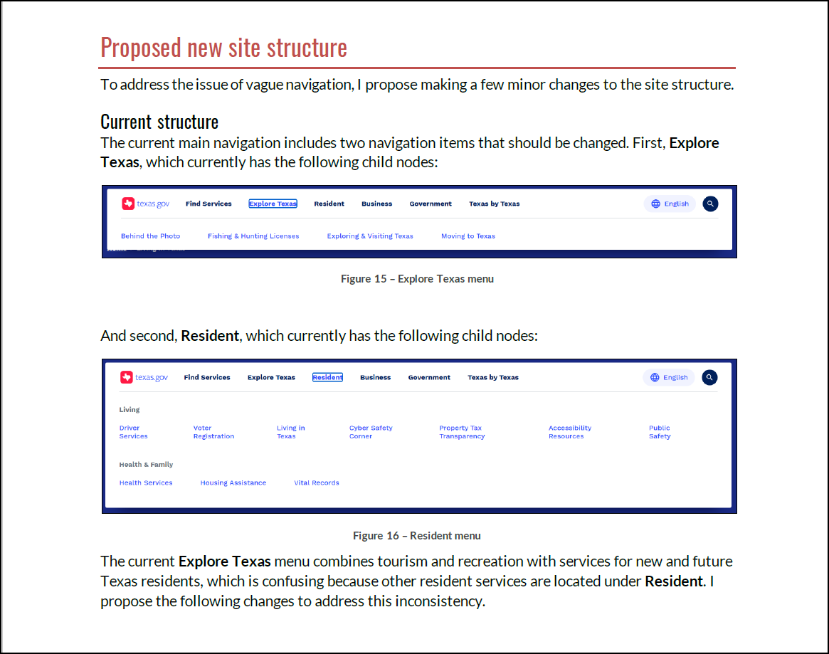
“Proposed new site structure” section of the report showing issues identified with the existing site.
