The project: Update a neglected website. Design system created by UX team.
Constraints: 3.5-day turnaround, no new content could be added
Tech: WordPress, CSS, HTML
WASHTO.org, the site for the Western Association of State Highway and Transportation Officials, hadn't been touched in years. What is WASHTO and what does it do? It wasn’t clear from the website.
Small text and components that weren’t chosen thoughtfully left the homepage feeling empty. An inconsistent, dull color scheme that didn't reflect any real design system combined with inconsistent use of components created a disjointed look and feel. Some of the labels were confusing, and there was no evidence of basic accessibility considerations. A few pages were years out of date, still featuring event write-ups from 2018.
TxDOT's Executive Director commissioned this facelift ahead of WASHTO's annual conference, working from a design system the UX team had already built. I had 3.5 days to do it.
The catch: I couldn't touch the actual content, and there wasn’t time to design a new information architecture. Much of the site's text is pulled directly from WASHTO's constitution, and rewriting it wasn't an option.
What I did
Rebuilt the site's pages using the UX team's design system, with larger, more legible type, better-organized content blocks, and a consistent color scheme in place of the old ad hoc styling
Removed outdated pages that no longer served any purpose
Traced a few formatting bugs back to custom CSS overriding the WordPress theme’s styling and updated the CSS
Updated vague or confusing labels for a stronger information scent
Wrote handoff documentation for the incoming state that will hold the WASHTO presidency starting this November, covering the components used, where things live in the WordPress builder, and the CSS issues. We wanted the next transportation department to benefit from our experience so they can start tackling some of the remaining issues.
My manager helped with some of the implementation on the committee pages and the conference page. She also handled some of the technical issues (such as access to the WordPress account and email) since those required coordination with the executive director’s office. We did the cutover together.
Future improvements
Given the tight turnaround, there just wasn’t time to make all the improvements the site needed. The site’s information architecture needs to be redesigned, the document library needs to be rethought, and the remaining accessibility issues need to be fixed. Ideally, the member departments would be encouraged to take a more active role in providing current content.
Why the project mattered
This wasn't a small internal tool. It's a public-facing site tied directly to an executive sponsor, with a hard deadline driven by a real event. Being trusted with it as an intern, largely running the redesign myself, was a vote of confidence I didn't take lightly.
Note that this was a one-time project, and I do not manage the site. The screenshots included are the best reflection of the work that I did since the site will likely change at some point after November 2026.
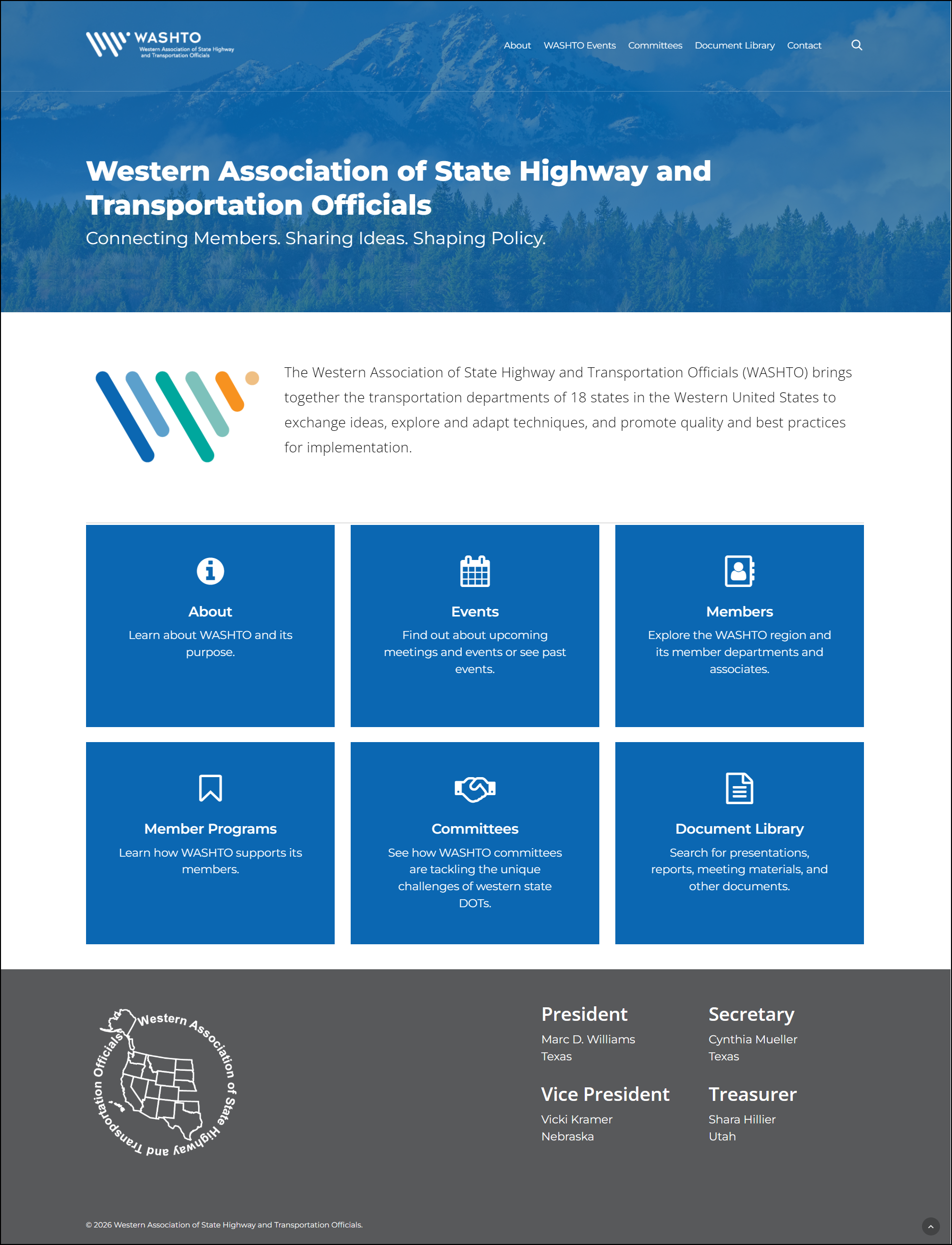
Redesigned homepage: Updated the visual design to align with brand guidelines, make better use of the space, an ensure consistent use of components throughout the site.
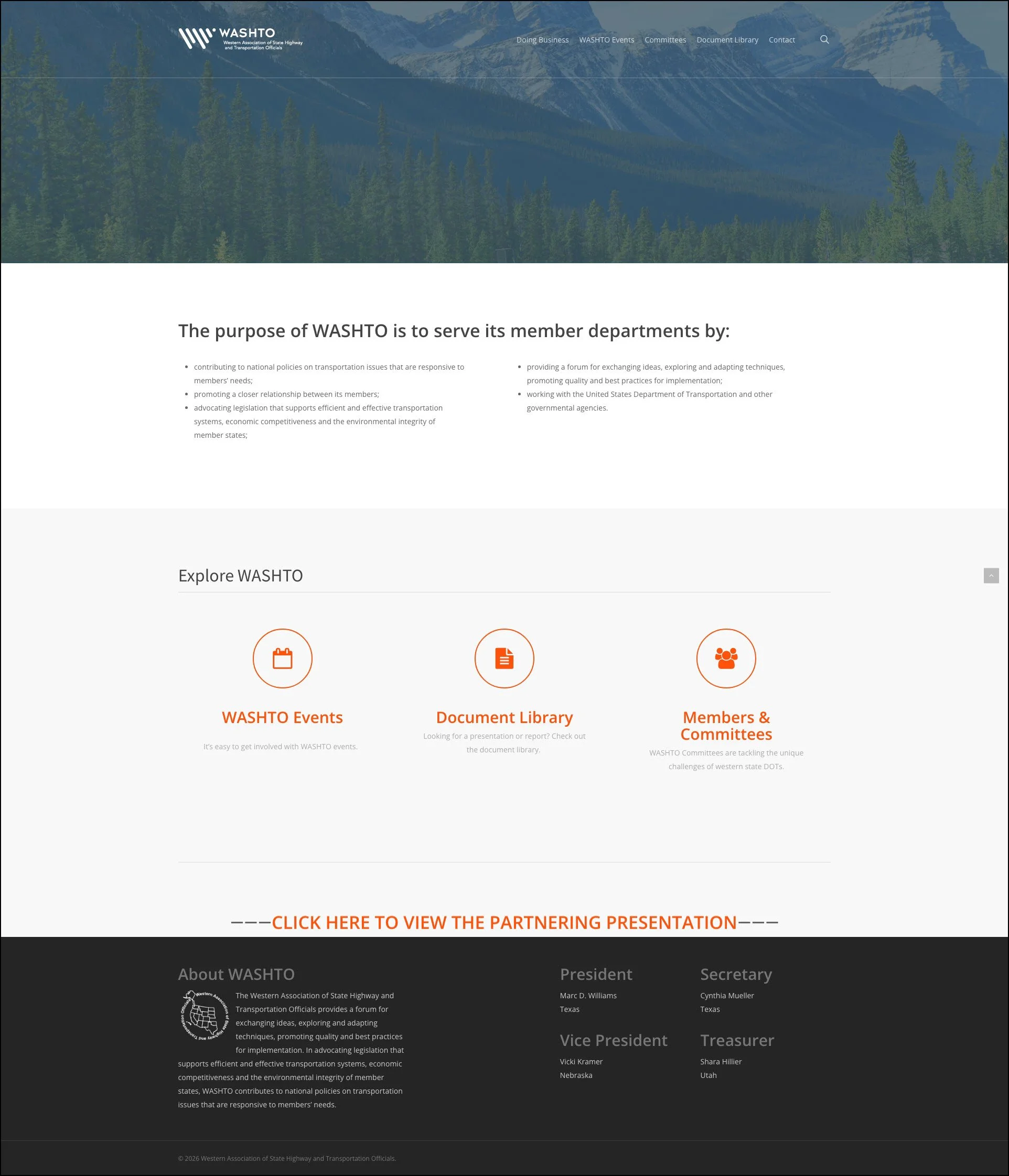
Previous homepage with poor use of space, low color contrast, and confusing purpose.
